In the media, we often hear speakers talking about the “Data Deluge”, “Big Data”, and the “World of Data”. As a matter of fact, digital transformation has brought us the advent of the Data Age.
But data are not intelligible at a glance. So as human beings are visual creatures the best way to communicate and understand any insight from processed data is to find the right visual representations for conclusions to be made.
Data visualization is the graphic representation of data. Data visualization is more than the graphic representation of data. As Edward Tufte, pioneer of data visualization would say: “Those who discover an explanation are often those who construct its representation.”
We can say, without fear of contradiction, that Data Visualization (or Data viz) is a new discipline and field of study that uses charts, maps, diagrams, infographics, icons, and illustrations to create beautiful solutions to make it easier to identify patterns and trends of data sets.
It is art and science, it is creativity and accuracy.
This cutting-edge discipline, constantly evolving and expanding. A great solution to solve information problems in climate science. It is both a technique and a formidable communication language to develop user-centred climate services, web applications and websites with high usability, accessibility and user experience.
We met Moritz Stefaner, a data visualization designer also on science-based and climate services projects, to discover in his own words what is data visualization. This interview is part of the open training course “Climate and risk communication” of the Training Initiative ToPaCS.
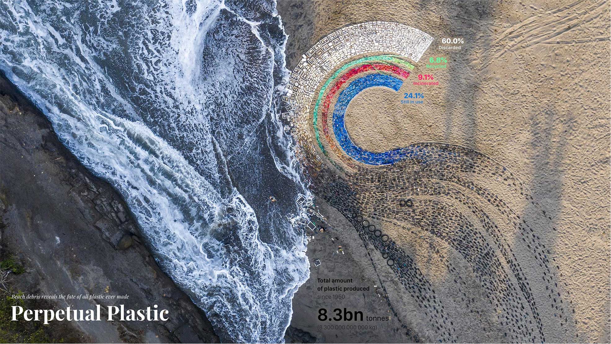
The featured image of this post is taken from the Perpetual Plastic Website. A project by Liina Klauss, Skye Morét and Moritz Stefaner. First prize at the National Geographic Ocean Plastic Innovation Challenge. instagram.com/perpetualplastic/


